210709_LoveLife_HeroBanner

Now and then: part 2


Serious fun

The second in a series of short articles highlighting Binary Vision’s incredible history of digital innovation from our earliest years to today. Here we explore how a fun, playful approach can deliver the most serious of messages…

Then: Lovelife


It’s 1999 and safer sex has never been more important, with HIV the fourth biggest killer globally (WHO).

Time to harness the new fangled ‘world wide web’ (it’ll never last) to deliver safer sex messages to young people in ways they relate to and remember.

Binary Vision created the Lovelife brand and website for the Health Education Authority, including a host of innovative features and an edgy young design, making the most of what was possible in the late 90s.
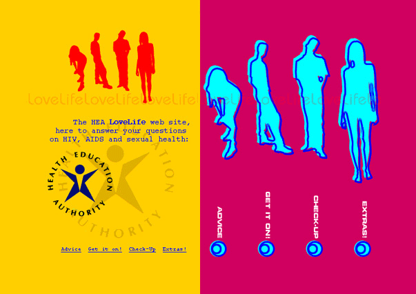
Lovelife

The Lovelife home page

As well as safer sex advice for teens there were valentine e-cards, a ‘romantic’ picture story of visiting a sexual health clinic and a click-frame animation of how to use a condom that was deemed so controversial it needed sign-off by the Secretary of State for Health. There were even questions in the House of Lords.

Binary Vision then conceived and delivered a highly original and playful addition to the site – the Playsafe game. Players had to add condoms / barrier protection to male and female ‘symbods’ before they partnered up. Then at the end of each hectic game, players saw a high-speed replay of their game showing how a handful of infected symbods could spread disease through the community if the player had failed to get barrier protection in place, in time.

Though technically complex to deliver using 90’s web tech, Playsafe was a simple, powerful concept which resonated with young people. And it was great fun to play.
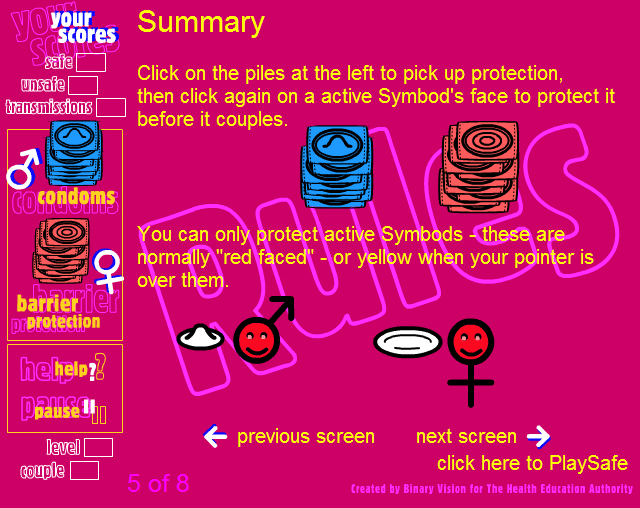
Playsafe games

Playsafe game (rules screen)

And now: Childcare Choices


Fast forward twenty years. Binary Vision wins the tender to create a site for all of the government’s child support offerings, across four departments. Our concept was to allow users – with just a few simple selections – to get personalised information about what funding might be available for their family. This was in stark contrast to the complex and time-consuming ‘calculators’ elsewhere on GOV.UK.

Since going live, with millions of parents using the site, research revealed that they love how information is personalised for them – and they told us they wanted more. So just recently we created a simple-to-use feature where parents can add in brief info on each child and see instant, targeted information, like this:

From the outset, we gave Childcare Choices a fun, exploratory feel where users can explore different scenarios: “what would happen if I were to start working again next year?”, for instance. A quick update to the income band and parents can see how that would affect the funding opportunities for their family.

Working with our clients


One thing that hasn’t changed across the decades is creating the best possible relationships with our clients:

Then

Collaboration with your team was a real pleasure… As to the finished product, this more than met our expectations.

Rodney Amis, Health Education Authority for Lovelife

And now

We’re getting lots of lovely feedback about your site – and I think it looks great. This is a really important milestone, and it’s a great example of a cross-Department product designed for and with parents.

Rachel Hope, HMRC for Childcare Choice

That’s it for ‘Now and Then’ part 2. Do check out part 1 – or watch out for part 3, coming soon!

Binary Vision Co-founders