“The team met all our requirements to the timescale required, without sacrificing on quality”
Simone Bryan, MRC
MRC’s Interactive Career Framework
Bold interaction design with a focus on real people.
The challenge
How to make something as diverse and complex as biomedical research careers really easy to understand, so researchers can make informed career choices?
What we did
Following an ‘agile’ (Lean) UX process of information and interaction design, we worked hand-in-glove with MRC’s Skills and Careers team to visualise, user test and then iteratively develop an Interactive Career Framework. And we brought it to life with real-life case studies, of researchers showing how their own careers developed.
Please also see our case study on the MRC website revamp.
How it turned out
The ICF performed well in our post-launch site survey (for instance, for ‘overall user experience’, 87.3% of users gave it 3 – 5 stars out of 5, with 17.5% giving the maximum of 5 out of 5. n=126).
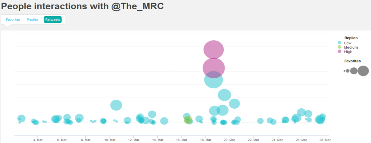
And its launch had a big impact on the MRC’s twitter profile – spot the launch date:

Building bridges across UK research
Having launched the career framework, we worked with these eight UK research funders to incorporate all of their funding schemes into a new ‘funding view’:
In the process, led by MRC, we created a common language and frame-of-reference for UK research funding, all for the very first time.
It was an object lesson in bringing stakeholders together, forging agreement by sharing with them the findings from our user research.
“We’ve received lots of feedback from users via Twitter about how useful the map is. This was a very complex piece of work and the team met all our requirements to the timescale required, without sacrificing on quality.”


