“It’s been fantastic to work with them through user research to delivery. ”
Jarrod Williams, RAF Cadets
RAF Cadets site
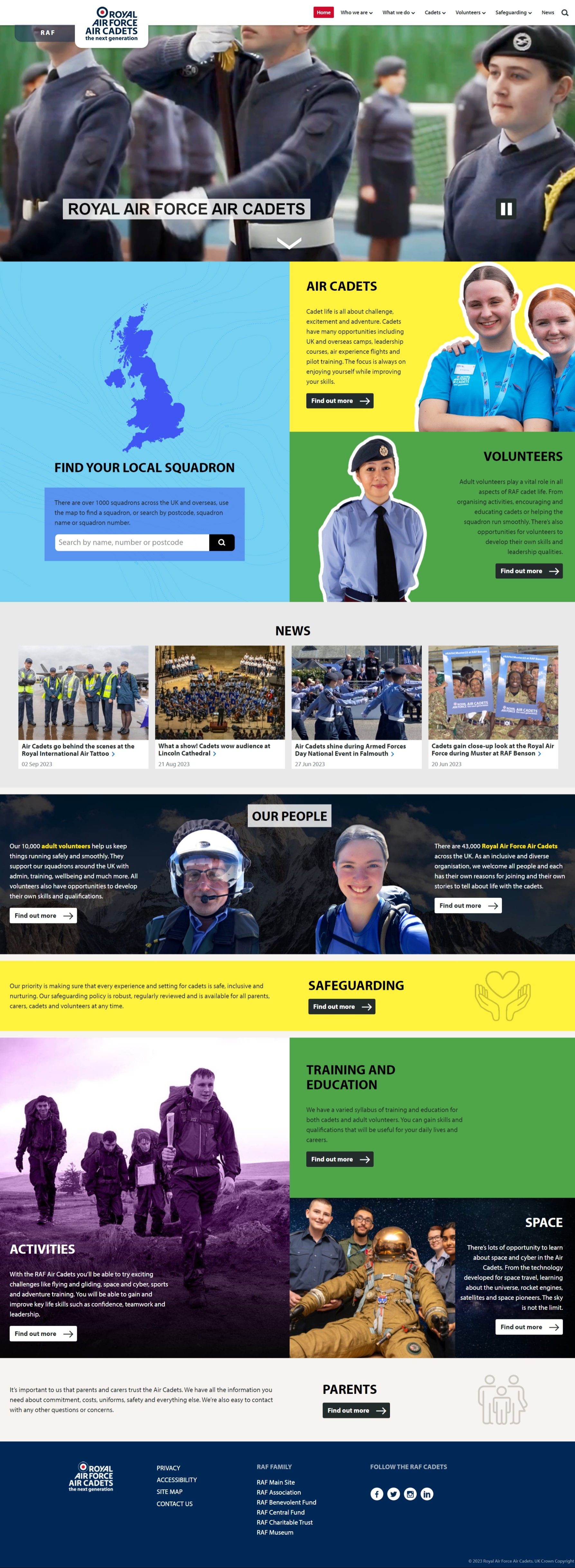
Binary Vision worked with the RAF Cadets team to re-design and modernise their website. We also designed and implemented an effective, and user-friendly way for website visitors to navigate between the main RAF website and the RAF Cadets website, bringing the two together without losing the distinctive feel of the Cadets site. The Cadets site is hugely important for the RAF as an engagement tool.
The challenge
The RAF website and the RAF Cadets webpages have historically been managed as two completely separate sites. The Cadets website hadn’t been refreshed for a number of years and needed a new look and feel, along with new content to ensure it was doing the best job possible to engage young people and adult volunteers.
We were asked to look at the best way of bringing the sites together as a family so that they all felt like part of the RAF but importantly, the Cadets site still looked and felt like its own distinct area, and appealed to both a younger audience and adult volunteers.
What we did
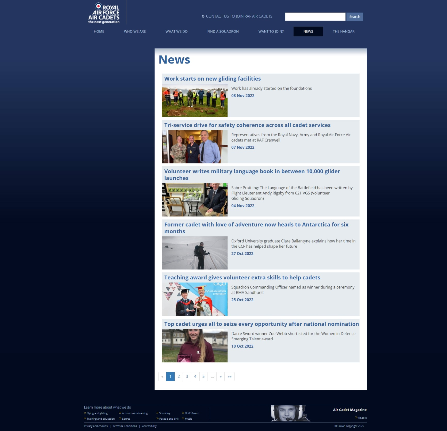
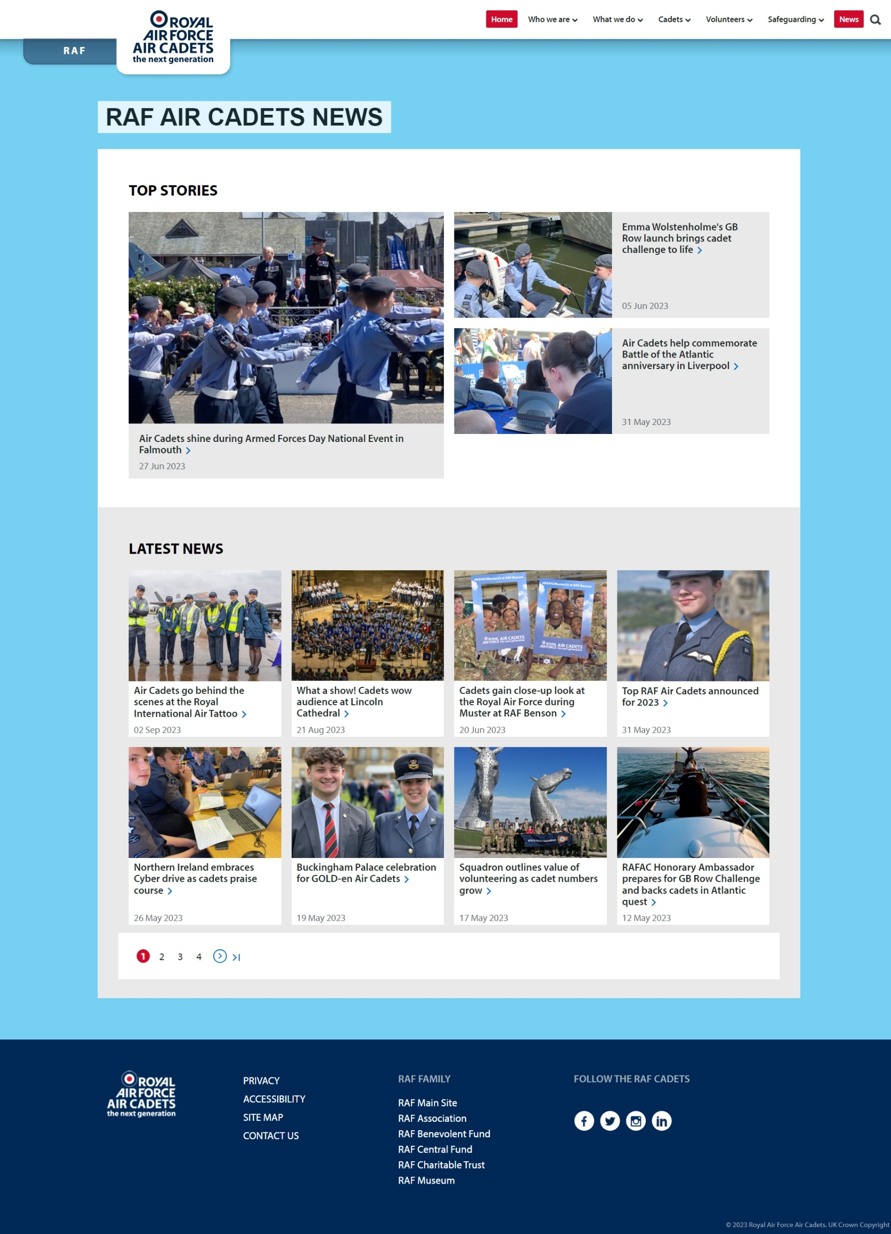
As part of the project we worked on updating the look and feel of the Cadets site, and helped to refresh outdated content. The aim for the Cadets site was that it had a more modern feel, appealed more to young people, as well as an older audience of volunteers, was easier to read, and had improved accessibility.
Before website re-design
After website re-design
We explored a range of options for taking people to and from the main RAF site to the Cadets site:
- One option was to add the Cadets link to a navigation menu but we felt that might be easily missed and confusing, and you wouldn’t always realise you were moving from one site to another. This isn’t something we’d recommend as a good design pattern
- Another possibility was a button next to the existing Join the RAF button, however, that felt like people were being redirected to a completely separate site and would be leaving the RAF site. It would also have been confusing to have a Join the Cadets button next to a Join the RAF button
- We explored a tab in the navigation bar which was the chosen option
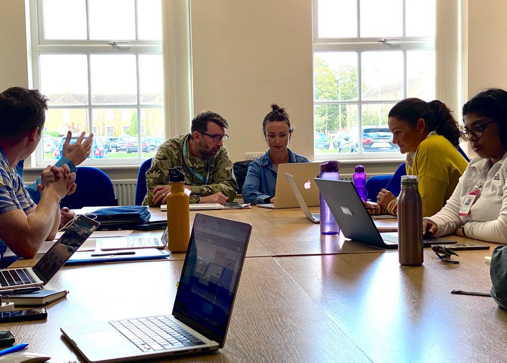
Once we had mocked up and reviewed the preferred option, our partners Lagom Strategy carried out user research. They engaged with both current and prospective cadets and adult volunteers, using both laptop and mobile devices. In these sessions users were asked to look at and share thoughts on a series of designs for the new website. We looked at designs for navigating the new site, the squadron finder and joining forms, and content pages on cadet activities and being a volunteer. The findings were shared with the project team on a Miro board, and a session was held prioritising who was best placed to action the feedback received from users.
Further user research will take place now that the new site is live. This will again take place remotely and explore how the site is being received in general as well as testing specific parts of the website identified as needing further attention.
The Before and After
Jarrod Williams of the RAF Cadets said of Binary Vision and Lagom: “it’s been fantastic to work with them through user research to delivery. Seeing the word ‘cadets’ next to the RAF logo on their site really demonstrates the Whole Force approach, and the bond the Air Cadets have with it’s parent force.”
